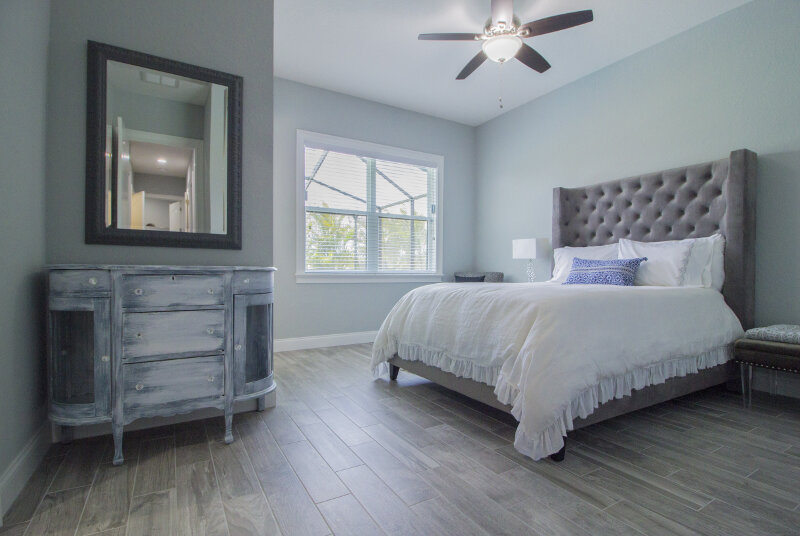
We definitely think you should design and decorate your home the way you want. But adhering to just a few simple mandates brings order to the chaos. When we walk into rooms that are designed using specific principles – geometry, proportion, scale, pattern – we can relax, our brains are at ease, it just works. As humans, we thrive on order, and that’s what good design is using rules to make sense out of what is otherwise random.
Once you know the rules, you can play with them. There’s an art to the way the eye sees design in terms of color, shape, texture, and proportion. First, you have to understand it, and you get more confident in applying those rules, you can really have some fun. These timeless principles prove that “rule” doesn’t have to be a four-letter word.
Layer Your Lighting
Unless you’re going for the feel and comfort of an interrogation room, make sure you’ve distributed light equally around your room. Start by considering natural light sources – which can be maximized and accentuated with mirrors for a full room glow – and fill in any blanks with a combination of lamps, wall sconce lighting, and overhead fixtures. But never rely on a single source, especially if it’s overhead lighting.
If you think “We don’t need any more lights, we have a light on the ceiling fan.” However, that’s a no-go. You want your light to come from different places, to encourage people to explore all areas of the room. Layered lighting is the best way to set the emotional tone of a space. One source of lighting will always struggle to carry an entire room.
Keep Your Base Neutral
Put away the paintbrushes dripping with statement colors. It might sound boring, but plenty of designers agree. Painting with neutrals is a smart way to ensure that your space ages nicely and doesn’t drive you crazy before you’re ready to switch things up.
We are so inundated with different design options these days, and keeping a neutral base makes it easy to keep the room looking timeless. If you’re craving color, express yourself with art and accessories – not paint. If you love purple, pull that in with an accent pillow; or if green is your thing, find artwork or a side chair in a shade you like. However, don’t paint your walls green. It’ time-consuming and expensive, and you can wake up one day and look at that gree and hate it. If you’ve just got some pillows or art to switch out, though, it’s not that big of a deal.
Avoid Matching Furniture
Furnishing a room is not a vacation package, so take a pass on the all-included furniture bundles. You know the ones: sofa, loveseat, end tables, coffee table, recliner, and lamps for one low price. And even if you’re not buying a full-meal deal, steer clear of the matchy-matchy trap by mixing furniture styles. We recommend an 80/20 formula, in which the majority of the furniture is the same style and the remainder represents a different era or design trend.
If everything in your house is traditional wood furniture, it can get boring pretty fast. But if you throw in a few surprising wildcard pieces of a completely different style, that makes it fresh and gives the room some soul.
Pile on Different Textures
Got a thing for pretty, shiny objects? We get it. But everything that sparkles is not going to make for a well-designed room. You’ve got to mix things up. That means making sure your bedroom isn’t just a sea of silky fabrics, sequins, and mercury glass. Every room should have five textures: shiny, matte, smooth, flat, rough. Adding an array of textures always makes a room look more expensive.
Decorate in Odd Numbers
It’s well-worn advice, but it’s still worth repeating. The “Rule of Three,” which holds that anything presented or arranged in odd numbers is inherently more engaging and interesting, is sacred in the design field (and in marketing, advertising, education, and a host of other disciplines). Following this rule can mean the difference between a polished space and one with a ho-hum, amateur vibe.
When it comes to accessorizing furniture like side tables and shelving, pairing things in groups of three is a timeless standard. Arrangements with odd-number groupings always look more appealing to the eye than those with an even number.


